Michael Sharp – Book of Leaves

Michael Sharp Book of Leaves6
Michael Sharp’s Book of Leaves is a work firmly steeped in the past, exploring scientific, photographic, and ecological histories within its pages. Using cyanotype, an old photographic process that results in a rich dark blue, Sharp placed dried leaves collected around the Utah State Arboretum at the Red Butte Gardens and created photograms once the paper was exposed. Leaving behind a ghostly outline, each leaf from specific trees tells a different story and hints at a distinctive personality.


Upon opening the small, compact box, the viewer finds what initially appears to be a modest book entitled Utah Diversity, and above this is a symbol that appears to be a beehive or perhaps a pinecone. On the box itself in diminutive type, we learn about the history of cyanotype and its use in scientific documentation of natural objects and also in blueprints. The artist also mentions a critical feature the viewer encounters when unfolding the book: bits of the cyanotype peel or flake off. This crumbling deterioration is analogous to the subjects within the pages, the fragile dried leaves, reinforcing the relationship between the subject and the book itself.


Once opened, the viewer is informed that the images following are a “representation of the (tree) populations.” It is here that the charming piece shows its true intentions. Each leaf, as if it were a separate person, appears with its Latin name and common name. No two leave are alike, and they are paired together at times because of shared or discordant characteristics. For instance, the Cully Black Birch and the European White Birch look like siblings, with a similar shape and outline. In other cases, like the Yoshino Cherry and Blacklace Elderberry, we have a very oval leaf with tiny jagged edges (Cherry) opposite a thin-leafed, smooth-textured Elderberry, which is reminiscent of a small flower plant in shape. Some leaves, like the Fairmont Ginkgo, have an almost human-like quality. One can almost see a face in profile on either side of the leaf, or perhaps even a pair of lungs, coming from this particular outline. Much like Rorschach tests, it is hard not to try and see shapes, people, or other fanciful interpretations. The more the viewer pages through the book, the more the march of quirky personalities and mysterious histories play out before them.


Book of Leaves is foremost a book of memories. From the precise curation of the trees that Sharp selected to the drying and exposure of each brittle leaf, this documentation reminds the viewer of each step in the process before them. Remembering that even the paper is an artifact of a tree turned into pulp, this piece is haunted by all aspects of ghosts concerning the humble tree.


But perhaps the most delightful feature of this work is what it transforms into. Book of Leaves can be stood upright and unfolded like a star-shaped accordion. Suddenly, it has transformed and mimics one of the many leaves found within, creating an organic pattern based on how the audience choose to unfold the pages. Each iteration and choice creates a new work in a way, reinforcing the concept of this book being about memory and adding a unique performative element. As mentioned previously, some of the cyanotype falls away as well, slowly eroding the book as much as the process of decay in nature. Sharp’s work is meant to be gently playful yet a bit fragile, referencing the subjects and the fleeting history that lies within.

Michelle Ray and the Sea – Part 2

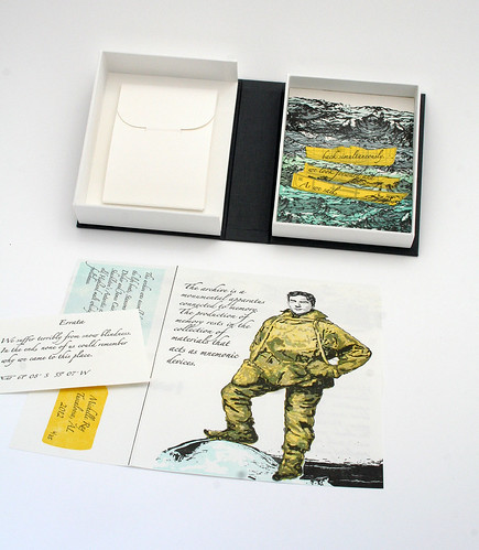
Michelle Ray Three Ships 4Three Ships
published by Michelle Ray in 2012, in an edition of 35.

With Three Ships, Michelle uses a more sculptural, or display book, format than she has with previous editioned works. This sets it apart from her earlier work, and lays the foundation for her subsequent book God Created the Sea and Painted it Blue so We’d Feel Good On It . . .

The piece is housed in a double tray drop-spine box, but rather than housing a book that can be removed and examined outside of the box, the box itself is the book. The right hand tray has all four walls intact and presents an image of the sea, layered front to back with cut out, printed components. The physical layering assures that the uppermost part of the image, which is, in this case, the horizon line, is physically further away from the viewer than the immediate foreground. The image includes bright yellow silhouette forms of boats on which text appears.

Michelle Ray Three Ships

Michelle Ray Three Ships

The left hand tray, with the spine side one, has a four flap wrapper with a tab and slot closure affixed to the back of the box. Opening the envelope reveals both a 6 panel, map-folded page and a small Errata card. The folded page is printed both sides with imagery and text, and includes the colophon.

Michelle Ray Three Ships

Michelle Ray Three Ships

Three Ships exemplifies once again Michelle’s ability to convey an abundance of thought and relationship with few images and words presented on so few surfaces.

This piece was created in response to a specific text as part of the BookArtObject Edition #4. BookArtObject is an informal group of book artists that uses their blog as vehicle discussion and as an arena to make small editions of handmade artists’ books in response to various texts. The text for Edition Four comes from Sarah Bodman’s book An Exercise for Kurt Johannessen, in which 100 short story titles were provided as starting points for the participating artists.

Three Ships is the title Michelle chose to work with, giving he opportunity to explore an ongoing theme – the sea. In a continuation of her choice to present relationships from a broad range of sources, this work draws from the memory of the three life boats from Ernest Shackleton’s Antarctic expedition: Stancomb Wills, Dudley Docker and James Caird, Shackleton’s stash of rare and old Highland malt whiskey, and the safety and foolishness of that expedition. The book also explores through mnemonic devices this relationship between time, memory and seeing.

My favorite bit is the Errata card:

We suffer terribly from snow blindness. In the end, none of us could remember why we came to this place.

Michelle Ray Three Ships Errata

Michelle Ray and the Sea – Admeasure

Michelle Ray Admeasure

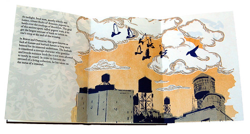
I have never met Michelle Ray but well remember the first work of hers I saw – The Kashash and the Archivist; it is one I wish I owned. Abecedarian Gallery represents Michelle, giving me a chance to get to know her through the works she creates. My respect for her continuing growth and work deepens with each new project.

Michelle Ray describes herself as a left brained maker; a devotee of organizing, list-making and labels. She also clearly loves language, research, storytelling and vast open spaces. Her level of craft is high, her writing skills well-honed and her evolving conceptual development is sophisticated enough to effectively translate multiple elements into objects so that they live in a state of complex harmony. Yet these works are not cumbersome or crowded; rich though they are, with words, imagery, reference and structure, they remain elegant and almost sparse.

This week I’m focusing on three of Ray’s limited edition book works – those that reference the sea:
Admeasure, Three Ships and God Created the Sea and Painted it Blue so We’d Feel Good On It . . .

Admeasure, the earliest of the three, was published in 2011 while Ray was an MFA candidate in the Book Arts Program at the University of Alabama.

Admeasure is structurally simple (an accordion book with pamphlet stitched pages in two sections housed in a paper wrapper) produced by uncomplicated procedures (letterpress, die cut, folding and stitching). Closed it measures 8 x 3 x .25 inches.
Michelle Ray Admeasure
The soft paper cover is printed in gray ink on a sand colored paper with a line drawing of waves that are turbulent and seem to be crashing off a rocky shore. There is no land in sight, only the horizon line of the endless sea.

Charmingly, the tab/slot mechanism that holds the cover closed is printed with the words

“I had a dream that I built a small boat & set out to sea in it.”

Michelle Ray Admeasure

On opening the book, we learn that Admeasure is a nautical term and refers to the act of measuring the dimensions and capacity of a vessel for official registration. Later in the book, the silhouetted forms of a bird and boat alongside upward and downward pointing arrows, illustrate how a vessel’s height and depth impact the spaces of the sky and sea.

The accordion pages are printed front and back, in the lower third, with more images of the roiling sea; a two sail boat rocked but upright appears on the fourth (of ten) panels. This panel also serves as the first page of a pamphlet, stitched through the accordion fold. A second pamphlet is stitched into the final fold of the accordion and goes through the book cover’s spine. This allows the book to be fixed in place in the cover, but also fully extended for a different viewing experience.
Michelle Ray Admeasure

The accordion panels are printed front and back with black line work and gray blocks of color; the text varying shades of gray. The two pamphlet sections introduce various shades of orange. While startling on first encounter, the bright, warm color gives a whimsical break from the prevailing muted tones, particularly as one of the images printed in orange is that of an albatross.

Michelle Ray Admeasure

The book utilizes quotes from Bas Jan Ader, a traditional pilot’s verse and draw’s from a variety of archetypal journey (including Ray’s own time spent in small boats).

It also gives clear directives: alongside the aforementioned orange albatross the words

“Now. Hold a live Albatross in your hands. Feel how hot it is. Smell its smell (dusty).

Under a cut-out of a woman’s silhouetted profile

“Go into a darkened room. Shine a flashlight through this cutout to project a silhouette on the wall.”

Michelle Ray Admeasure

Admonishments:

“Do not begin reading this book on a Friday, for it will bring you bad luck.”

Michelle Ray Admeasure

And a gentle suggestion:

“You are now being directed to create marginalia related to your journey at sea. Feel free to use all of the empty space on this page.”

Admeasure presents elements later projects have clarified about Ray’s engagement in the world. An interest in presence vs. absence, a love of the vast landscapes of sea and sky, an appreciation for the quirky and whimsical and her work as a book artist to draw connections between traditional lore and our continuing present.

Julie Chen – Family Tree

Julie chen family tree 1

Family Tree is a 2013 publication by California book artist Julie Chen, published in an addition of 50 copies. Production will begin in February; pre-production orders can be placed by contacting Abecedarian Gallery.

The publication is a set of 16 two inch cubes, housed in a drop spine box. Some surfaces are digitally presented and others laser engraved. The set presents six variations on a single image.

Julie Chen Family Tree07

The cubes rest in the box tray with adequate space above the tray edge for removal of individual cubes. Thus the cubes can easily be rearranged and rotated in a variety of configurations, either within or outside of the box tray. Six of the arrangements present variations on a single image, an image of shadows cast by tree branches on a sidewalk.

Julie Chen Family Tree03

The book arrives arranged with a photographically rendered image of the shadows and a brief text, the baseline of the text following the shapes made by the shadowy forms. The same arrangement of cubes flipped over 180° reveals a negative image of the same photograph of tree branch shadows and presents a different text.

Julie Chen Family Tree04

Two of the remaining cube sides are one or two word phrases with simplified tree shapes floating behind the words. The negative space is etched into the wood block, the positive space is raised and inked and looks like an inked wood block ready for printing. One side of each cube is inked in orange, the opposite side in turquoise.

I appreciate the sense this gives of a work in progress, as the piece as a whole, regardless of the state it is in, will always be in a state of progression from one version to the next. As with the histories the work focuses on, we always arrive somewhere in the middle of the narrative, and by re-arranging the blocks, can continuously shift the emphasis of the narrative.

Julie Chen Family Tree05

The remaining two sides are graphic representations of the shadows, printed in a palette of bright colors that are grayed down enough so that they aren’t jarring or garish.

The insides of both the top and bottom trays have visual ‘keys’ so that one can arrange the blocks in the order that presents an uninterrupted image.

Julie Chen Family Tree09

Due to the constraints of the presentation, two of the six arrangements (those with laser engraved text) are strings of four, one word phrases. While it is possible to rearrange the order, the initial arrangement has some real gems such as:

‘identity reinvented through interpretation’
‘connections emerging after dormancy’
and ‘patterns hidden beneath the narrative’


Julie Chen Family Tree10


These are but a few examples of the multiple arrangements (a set of 16 cubes has a possible trillion combinations).

The book was generated using cards drawn from the Ideation Card Deck (also available for purchase at Abecedarian Gallery) and included in the exhibition Ideation by Chance (click here to see online catalog of the exhibit) curated by Julie Chen.

Michelle Ray – recipient Gallery Director’s Exhibition Award

Michelle Ray.Three Ships.1

Each year, an artist is selected from the Artists’ Book Cornucopia exhibit for an exhibition award. Past recipient’s of this award include Casey Gardner (2012), Lise Melhorn-Boe (2011) and Sarah Vogel (2010).

I am pleased this year to announce that Michelle Ray is the recipient of the Artists’ Book Cornucopia IV Gallery Director’s Exhibition Award. Her work will be featured in a solo Reading Room exhibition April 18 – June 7, 2014.

Michelle’s work has been included in several group exhibitions at Abecedarian, and most of her available work is in inventory at the gallery. Last year Michelle was awarded an MFA from the Book Arts Program at the University of Alabama at Tuscaloosa. The consistent quality of the work I see coming out of that program is worthy of comment. Graduates of this program invariably produce work that is beautifully crafted, rich in content and effectively balances concept and content through thoughtful presentation and structure choices.

Of the many graduates from that program represented by Abecedarian Gallery, Michelle Ray has been among my favorites since my first viewing of her book The Kashash and the Archivist.

ABC11 Michelle Ray, The Kashash & the Archivist (2)

Much as enjoyed showing and placing this book, I was a bit bereft when it sold out. I had the luxury of musing over it countless times while it was in inventory, and found it warmly rewarding to introduce this book, along with other Ray titles, to my clients. I have continued to ponder its impact on me and have concluded that this title, along with several others Michelle has produced during her brief time in the book arts, remind me of the writing style of Annie Dillard. Annie Dillard with images. High praise indeed.

Ray has just finished up a residency at the Small Craft Advisory Press (a remarkable book arts/printing residency program affiliated with in Florida State University in Tallahasee), where she produced God Created the Sea and Painted it Blue so We’d Feel Good on it.

Michelle Ray God Created the Sea 1

I look forward to exhibiting her work next year.

Folded Fare Part 2 – Maher, Milman and Sawyer

Today’s post features three books that utilize folding techniques to create forms that carry content or even become the primary content of the book.

Kimberly Maher

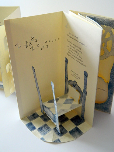
The wrap-around case that holds Kimberly Maher’s pop-up carousel book Crooked is fairly plain-Jane except for an angled flap on the front cover. The coolish gray of the cover and use of a hidden closure (magnets) quietly beckon as I lift the angled flap with anticipation.

Kimberly Maher.Crooked.2

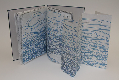
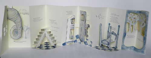
Carousel books often shine most brightly when displayed upright and fully open; happily Crooked also reads very well flat, as a ‘bookie book,’ allowing for a more focused and leisurely pace through the book than is feasible when displayed upright. The text and imagery, printed pochoir and letterpress in a limited palette of blues and grays, move from outside (a stormy wind illustrated by a swirling funnel cloud that, affixed to both sides of the spread, rises as the page is turned), to interior domestic spaces with stairs in the second spread and a pop-up four-poster bed in the fourth.

Kimberly Maher.Crooked.1

My favorite spread is the center spread with its grandfather clock on the left page. Rather than popping up or opening, the clock swells into a sweet curve as the page is turned. The other side of that spread features a door opening to reveal both text and pop up image. The last page takes me back outside again, to the garden, and is a two-layer spread.

Crooked also displays well. What I first notice on setting it for display as how nicely the angle of the cover flap mimics the angle of the interior pages.

IMG 0117

Maher’s text is composed from select nursery rhyme verses and lyrics in which the absurdity of the narrative is amusing. Her intent is

to entice the viewer into a false sense of pacification by subtly revealing a much darker illusion she examines defense mechanisms-notions of escape, breaking free from restraints or oppression.

click here to order this book

Barbara Milman

Barbara Milman.Unnatural Histories #33 Seaside Stories.1

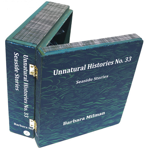
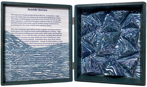
Barbara Milman’s piece Unnatural Histories #33 – Seaside Stories uses folds to create shapes that not only carry imagery, but also become specific and non-interactive shapes, held static in this case. Although the viewer isn’t able to move the pages, there is still a sensation of motion, created by graphics and forms that repeat in a way that mimics the ebb and flow of the ocean.

Milman’s receiving a gift of several cigar boxes prompted the creation of this series; this particular piece has a one page text related to climate change affixed to the inner front cover; the wave forms are on the boxes deeper, right side.

Barbara Milman.Unnatural Histories #33 Seaside Stories.2

Suzanne Sawyer

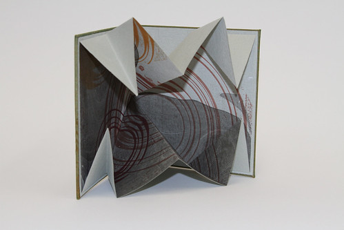
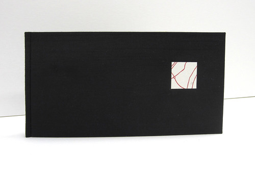
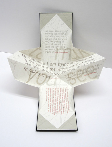
Suzanne Sawyer’s To Make You See is a single sheet Turkish Fold housed in an elegant black cloth case binding. A square label of sorts is on the front cover, although the label doesn’t have an actual title. The label instead has a few ghostly and randomly placed letters amid intersecting red lines.

Suzanne Sawyer.To Make You See.2

Once open, the orientation is appropriate for reading both the colophon and a brief historical snippet about Al-Mutanabbi Street. To read the rest of the textual content it is easiest to rotate the piece ninety degrees. Three quotes, one by Joseph Conrad and two by Lucius Annaeus, Seneca are laid out in various sizes; Conrad’s quote is in larger, and darker type. The words To Make You See, along with intersecting gray lines (a map of Baghdad), form a backdrop for the quotes.

Suzanne Sawyer.To Make You See.1

With very little text, this piece provides historical context alongside well chosen quotes. I was familiar with the words of Joseph Conrad, remarking on the power of the written word, but not with the words of Seneca. Seneca’s quotes strike a nice balance, including words about mankind’s search for meaning and a method for finding inner peace.

click here to order this book

Cornucopia’s Folded Fare – Part 1

Rare is the book that doesn’t rely on folds; there are the utilitarian folds of the codex bound book, the over-the-top magic of flexagons and magic-wallets, the accordion so well suited for display books, pop-ups, pullouts, map folds – the list is a long one.

This post features two artists – Sammy Seung-min Lee and Joshua Orr, whose works incorporate thoughtful use of the fold as a way to marry concept and content.

Sammy Lee’s Three Willows Bindery

Sammy Lee Three Willows 3

Before even opening three Three Willows Bindery by Sammy Seung-min Lee I suspect I will be captivated. Rather than being bound on the left, the book is opened by flipping the pages up towards the top edge, bound using this an exposed spine coptic stitch. The skewed and asymmetrical shape of the book hints at architectural content as the graphic depicts an aerial landscape view. The graphic is of raised shapes cut from material (printed paper?) that has an embossed wood grain, a lighter tone of brown than the surface underneath. When viewed from either side there is physical topography created by mountains and valleys of pleated paper. When I do open the book, the stage is set. I know I am entering a specific environment.

Sammy Lee Three Willows 2

The contents of the book are almost entirely visual. The only text, aside from the title is the dedication “For Three Friends” and the few words that appear as part of the landscape on street and building signs or on the included architectural drawings. The visual narrative begins with a journey through an overgrown area littered and gritty, a vacant and abandoned city lot. In Lee’s words, the project “documents the personal narrative of discovering and reinvigorating a forgotten space.”

Sammy Lee Three Willows 1

To create a virtually wordless work that tells a tale of a specific time and place in a way that engages an uninformed audience using shapes, both physical and visual, images both photographic and graphic and color, but no words, is not an easy task. Lee has achieved a successful balance between over simplification and complexity.

Lee explains:

The book is comprised of three different types of geometric pages, varying in shape and size. The pages’ contents can expand and interact in multiple permutations based on their folds, much like a map can be refolded in various ways. The pleats of the pages also resemble the topography of the land: the overall shape of the book mirrors the site.

Joshua Orr – Deluge and Shifting

Joshua Orr Deluge 3

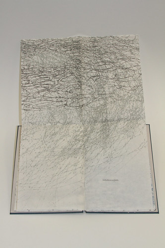
Deluge is a slim, lightweight volume housed in the three sided box. On first examination the book presents as an assortment of printed shapes, in cool tones on lightweight folded sheets. With each turning of the page there are new patterns and combinations of patterns to consider. Closer examination reveals a very tidily placed textual narrative.

To access the narrative requires more interaction with the individual pages. For example a page folded in quarters is sewn in, the top half can be lifted, exposing the other side of the printed sheet. To read the phrase “tides move and swell” requires lifting the folded page towards the top edge of the book to access (thus moving the page and swelling its size).
Joshua Orr.Deluge.1
Just as I settle in to the predictable rhythm of turning a page and lifting it to access the next phrase, the format shifts to folded page that extends horizontally. At about this same point in the book the imagery is decidedly more complex and chaotic with more of the page surface covered with marks that appear in two colors rather than one. The final graphic is of flattened spiral shapes trapped behind a rectangular grid that reads as a barrier, or fence.

Joshua Orr.Deluge.2

The book has a flow that brings to mind The Beaufort Scale, an empirical measure that relates wind speed to observed conditions at sea or on land. The slow pace of reading the text combined with the use of lightweight papers, muted colors in neutral tones that do not shout loudly or distract are a striking and effective contradiction to the agony presented in the text.

Shifting

Joshua Orr.Shifting.2

Orr’s attention to detail in Shifting starts with the case, a shimmery duotone green and gold cloth (yet another work without a label on the outside . . . Is this a trend?). A livelier green tone paper chemise is bound into the case and houses the book itself. The placement of the colophon on the outer case means I am privy to production details before I open the book itself.

Thumb slots make pulling the book out of the chemise an easy and enjoyable task. The front cover of the book is indicated by a circular graphic surrounded by speckles, printed golden brown. This graphic is repeated in other earthy tones and various sizes inside the book itself, which consists solely of a single sheet, folded Turkish map style. Pithy and quiet, the entire text totals seven words. No more are needed; the project is a complete presentation of what is evidently a personal exploration of domestic realities.
Joshua Orr.Shifting.1

I find Shifting compelling in that lacks a strong and obvious point of view. I have returned to its quiet homily again and again throughout the exhibition. The gift of a work like this is that is triggers a state of mind without expectation that my state of mind reflects or mimics that of Orr.

Contact the gallery to inquire about availability of these titles.

Cornucopia’s tactile textiles: Briand, Holster and Wehr

Three of the books in this years’ Cornucopia are particularly rewarding haptically. All three are one-of-a-kind books relying on touch to be fully appreciated.Sadly few of you blog readers will be able to personally delight in the sensuousness of these works. Even so, I hope you enjoy reading about the works of Servane Briand, Elizabeth Holster and Beata Wehr. More details about all three can be found in the online catalog.

Touching the outside covers of Servane Briand’s déchirures (made from a cashmere sweater) is comforting in the way that stroking a cat can be comforting.This indeed is one of her intentions – to make a book that is ‘comfy’ on the outside, with spiky content within.
Briand introduces another kind of soft to the book’s covers with laid on bits of Kozo paper, torn at the edges and printed with a series of words that reference the book’s interior contents. Bigger lumps take the form of embroidered shapes. The back cover is solid softness.

Servane briand dechirures cover detail

Torn paper edges peek out from the head and tail edges in a pleasing repetition of what the torn paper edges on the cover. Upon opening an 8 panel accordion is revealed, each panel, including end panels, with a printed image of something spiky from Briand’s current geography, California. Included are images of sharp edge pinecones, various cacti, the pointy bark of a palm tree’s trunk.
Servane Briand.dechirures.1

I appreciate an artists’ giving consideration to the back side of accordion books and this Briand has done with a composition of vertical, straight edge strips of kozo printed with layers of text and purply red unryu, simulating the red of gashes in the skin. The compositions work both as individual panels and when the entire text block is unfolded (to a length of 40 inches). A horizontal band of text spans the three right panels, tidily placed in the bottom fifth of the panels. The text gives the reader a few factoids about the Cactus family. I learn (or am reminded of something I suspect I learned at some point in school) that the spines Cacti not only defend but provide shade that lowers the plant’s water loss through transpiration.
Servane briand dechirures

Briand mentions a few things ungleanable from examining the book itself:

Déchirures was born in translation! I was amused by the term “softcover” and intrigued by the emphasis that exists in the American publishing world bewteen “hardover” and “softcover”.  I started to work on a series which is a “jeu de mots” on the French translation of “softcover,”  a reflection on the wider use of softbinding in France — even for first editions — and a statement on the invaluable feedback we get from touching a book (something lost in digital editions).

This book has been sold.

Quite different from the soft comfiness of Briand’s use of a cashmere sweater is Beata Wehr’s Blue Book About the Past.The book is housed in a blue canvas pouch with fold over flap. The pouch is encrusted with paint and texture, its surfaces appear pebbly and rough and also reminds me of the pock-marked images of lunar scapes, but in bright and beautiful variations of cobalt and cerulean blues.
Beata Wehr blue book1

My eyes have not deceived, the surface is rough to the touch, the protrusions unyielding and nearly as abrasive as coarse sandpaper.

The book itself has artifacts that, taken out of context, could be from some distant, unknown land. Closer examination renders the objects more familiar – bits of rusty metal and wire, 35 mm sections of film stitched in place through the sprocket holes, broken off metal keys, spiky organic bits that I later learn are agave thorns, arrayed in vertical compositions through the 4 pages and on the covers of the pamphlet sewn text block.

Beata Wehr blue book2

I especially appreciate that the stitch lines are left exposed on the back of each page so that a page spread shows the patterns of the stitch lines on the left, with objects stitched into place on the right. Mechanically simple, the pages turn well and lay flat when asked to. The challenge of working with additive objects that have bulk that is met well in this book.

Beata says

The pages of this book are made out of old painting cut in pieces. I stitched to them three kinds of objects: old slides of my artist’s books, agave thorns from the desert I live at now and found metal pieces, whose history is unknown to me.  All of them speak about time and transience and create short stories on every other page.

The cover of Elizabeth Holster’s book, Black and White, resembles a portfolio; the only surface treatment strips of mulberry, one each front and back. On opening, I am pleased to discover a work with page spreads that bring to mind the oversize coffee table monographs; the ones with full bleed images running across the entire spread; the clutter of explanatory text appearing elsewhere in the tome.

Elizabeth Holster.Black and White.2

Each of the 7 page spreads, that include both pastedowns, is a skillful composition of mostly solid (i.e. not patterned or very subtly patterned), neutrally toned geometric shapes. The shapes are a combination of various papers, fabrics, buttons and leathers, some held in place with tidily accomplished hand stitching, some cut, others torn.

What is exciting about this book is the abundance of shape and texture accomplished with a very basic set of materials. Details such as the overstitched scalloped hem of a piece of fabric, or the slightly skewed placement of shapes are not fussy additions but rather thoughtful contributions to the overall image.

Elizabeth holster black and white3
Holster explains that this book

explores the idea that while we tend to talk about things as either / or, in reality there are a host of variations between black and white.

In fact, although muted and subdued, the palette of the book is many steps removed from black, white and gray.

While on display at the gallery, I have given myself the treat of turning the page at the end of the day, so the first glance at this book (placed flat and opened on a low pedestal) the following day seems fresh and new. I do wish there were more pages.

This book has been sold.

Cornucopia Miniatures – Boyd, Kang and Spring

This year’s Artists’ Book Cornucopia features three works that fall into the 3 inches or less US standard for miniature books. All are editioned works and all three utilize an accordion format. All are well crafted and feature content that fits their diminutive size well.

I hope you enjoy reading about Louisa Boyd’s Stardust, Jessica Spring’s Inflammatory Guide . . . and Sun Young Kang’s Memories Unfolded as much as I’ve enjoyed having a chance to examine and remark on them.

Louisa Boyd.Stardust.2

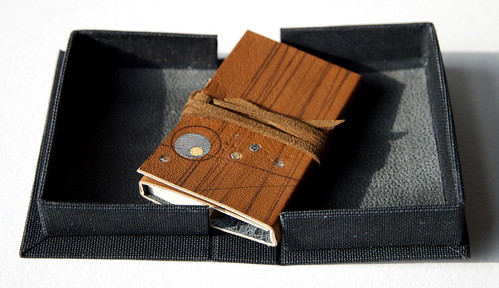
Louisa Boyd’s Stardust is housed in a black cloth clamshell, sans label. The fit is snug. The book is wrapped in a brown leather wrapper with hand-applied crayon lines, leather dots and metal foil. The top most panel has a series of vertical, but not exactly parallel lines that, on first glance, look like wood grain. Two cross-directional lines, also slightly angled, begin on the cover and wrap all the way around the wrapper. The bottom third of the panel is additionally adorned with silver foil and leather circles. The wrapper is held closed with a leather thong that is a bit too long and unfortunately detracts from this otherwise refined miniature.

Louisa Boyd.Stardust.1

Stardust’s riches are made apparent when the wrapper is fully opened. The interior lining mimics photographs of earth masses on planets viewed from space and is also slightly corpuscular. These shapes, printed in orange over cool black, are overlaid with gray markings that emulate celestial maps.

Louisa Boyd Stardust 2

The text block itself is a concertina. One side has surface applied markings in rust, ochre and black, a landscape of sorts, with spiraling masses above the tree dotted horizon. Above the horizon line holes of varying sizes are punched throughout the text panels. The back side of the concertina is not imaged, but the punched holes create a pared down version of the front side image.

Because the concertina is only half the width when folded of the wrapper that contains it it is possible to see both the text’s imagery and the wrapper liner’s imagery simultaneously. I find this very appealing.

Louisa Boyd Stardust 3
Says Boyd:

Stardust is part of a series of work that considers themes of infinity, mortality and the journey of the human soul and spirit.

Jessica Spring.An Inflammatory Guide.1

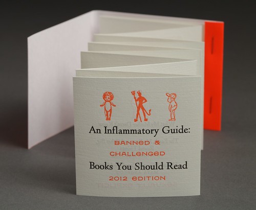
The small but assertive An Inflammatory Guide: Banned & Challenged Books You Should Read by Jessica Spring shouts out with a fluorescent, hurt the eye orange cover that mimics a match book cover. This book also does not have the title on the cover but instead has the directive ‘open mind before striking’.

Jessica Spring.An Inflammatory Guide.2
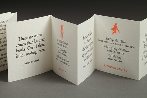
The accordion fold book uses every available panel to present quotes from a variety of sources, alternating with lists of titles printed in black ink, with their offense printed in orange. So we learn that Huxley’s Brave New World, Alexie’s The Absoluteley True Diary of a Part-Time Indian and Lee’s To Kill a Mockingbird are among the most challenged books of 2011 – the reason? Racism.

Sun Young Kang.Memories Unfolded.1

The case for Memories Unfolded is unusual. The back piece has a back cover, spine piece and front tab that is only half the width of the text block. The front cover is attached only to the text block, and not the rest of the cover.
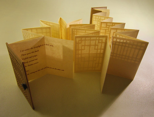
Sun Young Kang Memories Unfolding 2This design allows the book to have the protection of a case binding at the spine, but still allows the spine to be exposed after opening. It also creates an opportunity for more than one loop closure at the front; one holds the front edge closed, the other holds the spine piece in place. The placement of the ‘button’ part of the closure, made of a spiral of dark brown linen cord, mimics the placement of a door handle. The front cover of the book along with the partial tab, has paper cutout images of traditional Korean doors.
Sun Young Kang Memories Unfolding 1
In another artists’ hands these details could be construed as overly fussy, or come across as using adornment for adornment’s sake. In Kang’s work, these elements not only introduce ongoing themes that reflect the simplicity and value of form and ritual, they present a primary theme of the book:

I have created this shadow book with paper-cut-out images of Korean traditional doors. The process of cutting the pattern of the doors to create shadows recalls my memories of my grandmother in her old house. When I was inside, I could see the shadow of Grandmother cast on the paper doors from out side. Grandmother’s presence as a shadow on the door has remained a strong image in my mind. Unlike many other doors, the traditional rice paper door does not totally block the inside and out from each other. It only creates the concept of this side and the other while simultaneously connecting them to each other. When this accordion book is unfolded, the pages are shaped as closed, connecting the memories of my Grandmother, who is now in the other side, with myself in this world.

When open and fully extended the duo layer pages present a variety of traditional door patterns, cut out and backed with paper that is somewhere between transparent and opaque. In low light, the patterns are subtle, with stronger lights, the lines of the doors cast shadows. Kang’s work often focuses on the endless circulation of life, in this case she uses light creating shadow as metaphor for life creating death. Her text, minimal and perfect, is revealed when a single folded panel is opened.

Regarding concept Kang says:

Death is not the end, but the other side of life and a part of it. The lost come back as a memory.

Each story, the fragments of memory, is spread out on this screen. The screen is a metaphor of the inseparability of life and death. Light from one side casts a shadow on the other, just as life, this world is inseparable from death, the world beyond.

This edition is sold out.

C&C Press – Matt Cohen & Sher Zabaszkiewicz

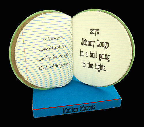
C & C Press.That's What You Write About - Give & Take.2The two books That’s What You Write About – Give & Take And IN THE FACE OF IT from C&C Press live in custom boxes; boxes that are more enticing than most both because of their lively colors, and that their design and construction includes accent colors along the joint. I like things that are square so I’m first drawn to the blue and red box with Morton Marcus stamped on the spine.

C C Press boxes

I open the box to find not a square box, but one that is round. To meet the challenge of binding a shape that has no vertical fold the book is stab bound in a double x pattern that only goes front to back, not around the spine edge.
C C Press round spine detail
An inevitability with stab bindings is that they don’t open as well as I think books should. This one, however, has a nice deep spine piece that allows it to be gripped in one hand, while the other hand turns the pages, applying light pressure as needed to hold a page spread open. When I hold a book like this, I want to stand up; and when I stand up with a book of written words I feel like I should be reading aloud. Perfect – poems enjoy living in sound waves in addition to living on printed pages.

The book presents two pieces by poet Morton Marcus, presented one alongside the other rather than one following the other. That’s What Your Write About is printed on the left of each spread, on letterpress printed blue lined paper, in a rendition of the poet’s own hand. The hand that gets to turn the pages (in my case my right hand) is thrilled to feel the impressed blue lines, while my eyes appreciate the red vertical line that simulates that blue-lined paper that was endemic in my youth, the linespace decreasing as my handwriting grew more skillful and sophisticated.

Looking at this book my mind wanders, trying to remember the last time I felt the thrill of excitement that looking at a stack of blue-lined paper used to bring. That this paper is now something I feel nostalgic about isn’t something I’d have ever predicted.

Back to the book: the right page of each spread presents Give & Take in a large typeface that once again has me waxing nostalgic as it looks like (and lo and behold, on reading the colophon I learn that it is indeed) the type face used for ‘old timey’ playbills. From the colophon I learn that Give and Take was printed using Playbill wood type, found in the basement of a Seattle boxing ring.
Sher and Matt say:

That’s What You Write About – Give & Take” features two poems by renowned poet and author, Morton Marcus. While preserving the integrity of the author’s original text, the decision to marry these two poems and their respective titles creates a third poem in which urban and rural themes interact. This third poem focuses on the environmental impact of urban life.

C & C Press.In the Face of it.1
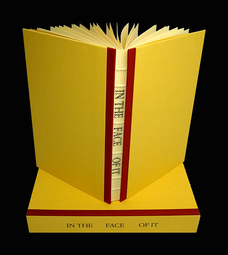
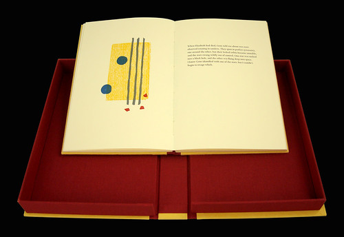
Although IN THE FACE OF IT from top view looks like a case bound book the spine is exposed, with the title printed vertically along the outer folds before the pages are folded and bound, making the title visible on the spreads between sections. Without a spine to interfere the book lies flat, inviting lengthy perusal of spreads that include multi-color printed woodblock images and text. Both the writings and original woodcuts are by poet and book artist Gary Young creating a serenity and flow throughout the book.
C & C Press.In the Face of it.2

Sher and Matt say:

IN THE FACE OF IT contains original poems and woodcuts by poet and book artist Gary Young of Greenhouse Review Press. The book is dedicated to Elizabeth Sanchez, Young’s close friend and mentor. His series of poems are a response to her death. The exposed spine sewing was chosen to the reveal the printed title. The registration of the print on the folds of the pages gradually ascends. The effect is that the reading experience visually reflects the temporal nature of the poet’s grieving process.

Click here to see the online catalog page for these books.